

Saturday, February 25, 2012


Wednesday, May 4, 2011
Guide Guide
Guide Guide is an incredible useful plug-in for Photoshop. I don't know how many times I've hand placed guides in the center of a PSD, or for margins. This plug in makes it oh so easy:
http://www.cameronmcefee.com/guideguide/

http://www.cameronmcefee.com/guideguide/

Tuesday, April 12, 2011

Monday, April 11, 2011


Sunday, March 20, 2011
Scanning tips & tricks
When scanning in a painting several undesirable things happen. Because of the strong white scanning light every little bit of texture is exaggerated, also the colors and values tend to get skewed from the original art. Here are a few things I do to help mitigate the problems.
I have a Mustek A3 scanner. Maybe not a top of the line scanner, but I like the large size (almost 11" x 17") and the price was right. I've used it for years - and with a few tricks in Photoshop I can get a decent scan of original artwork with it.
Here is a raw scan of a quick painting I recently did. The painting is done in acrylics on Aquarelle Arches hot pressed watercolor block. I tend to prep the surface with a fine layer of matte medium with brush strokes first horizontally then vertically to create a fine pseudo canvas-like texture.
 Notice how dark the scan is, and the texture of the paint is overly strong, while I love impasto brushstrokes (the emotional impact of an original Rembrandt at the National Gallery in London literally forced me to sit down in front of it and stare at it in awe for 2 hours!), illustration work tends to require a little more...evenness:
 What I do is take 2 scans. I align each scan to the edge of the scanner, and I flip the painting for the second scan.
 Now all of the highlights and shadows of the brushstrokes on the 2nd scan will be exactly reversed. In Photoshop I place the 2nd scan on a layer on top of the 1st scan and set the opacity of this 2nd scan layer for 50%. The effect is that the highlights and shadows of each layer exactly cancel each other out.
 This helps greatly to eliminate the overly-strong brushstrokes, but the nice thing is you still maintain some of the painting texture - that more closely matches the texture of the original. Unfortunately the scan is still dark, the contrast and colors are still not accurate. Next I set the original painting next to my monitor and adjust the Levels and Color Balance to match the original as close as possible.
 This part of the process can take a while as you adjust color, saturation, contrast, and so on to get as close to the original as possible. You might even want to enhance it a little - improving your value pattern and color harmony. I like to save one version off that is as closely calibrated as possible before doing an "enhanced" version. The final result should be a decent scan of your painting.
I have a Mustek A3 scanner. Maybe not a top of the line scanner, but I like the large size (almost 11" x 17") and the price was right. I've used it for years - and with a few tricks in Photoshop I can get a decent scan of original artwork with it.
Here is a raw scan of a quick painting I recently did. The painting is done in acrylics on Aquarelle Arches hot pressed watercolor block. I tend to prep the surface with a fine layer of matte medium with brush strokes first horizontally then vertically to create a fine pseudo canvas-like texture.


Saturday, March 19, 2011
Legend of Badass
The book is out now, so I guess it is time to post the art I did for LEGEND OF BADASS!!!!
I just love Ben Thompson's writing. It's visceral and delivers a punch. You should check out his blog, it is quite literally "badass". Here are the illustrations I did:


For anyone in the San Francisco Bay Area I'll be doing a book signing with Ben at Booksmith in the Haight on April 5th at 7:30pm. It would really make my day if you showed up! I'll have a special art print available just for you. ;)
I just love Ben Thompson's writing. It's visceral and delivers a punch. You should check out his blog, it is quite literally "badass". Here are the illustrations I did:
The Norse giant Sutr

The archangel Michael

Rama an incarnation of Vishnu

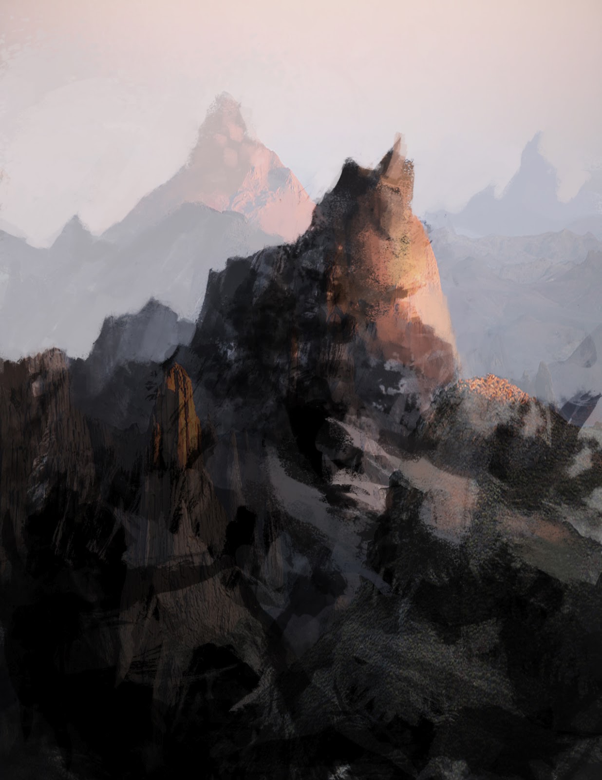
Mt. Doom!

Professor Moriarty

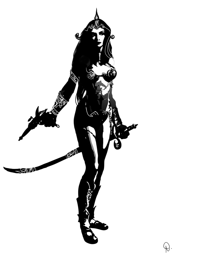
Mordred

The Monkey King

Fin McCool

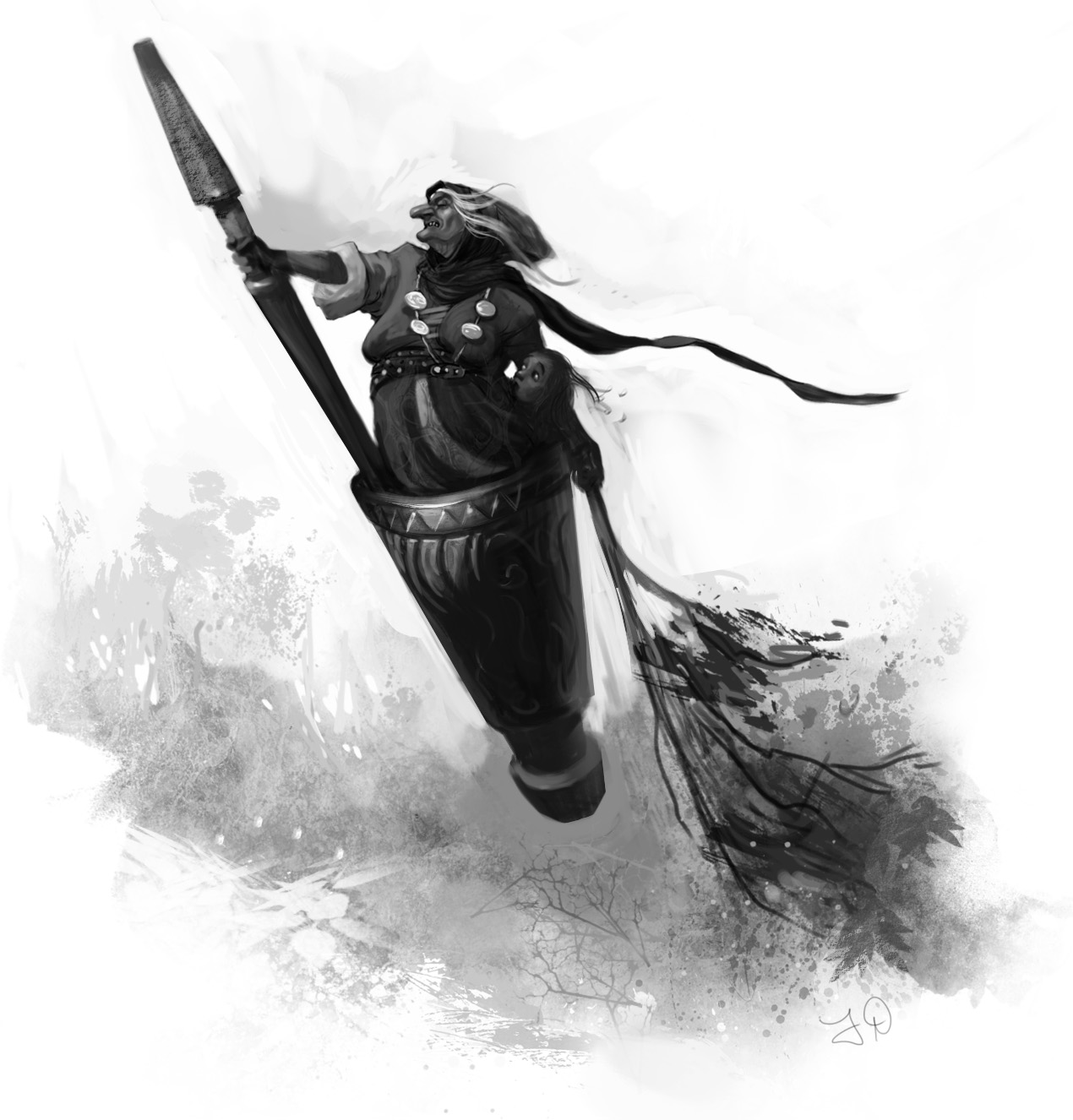
Baba Yaga
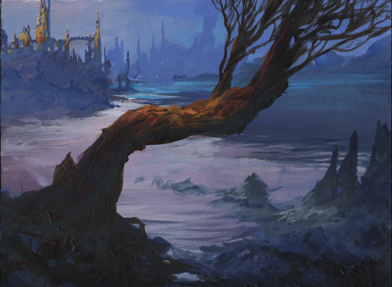
Baba Yaga's Hut!

My friend Winona and I were working on a project for Microsoft and we tried hard to convince them how cool Baba Yaga would be in a video game. Unfortunately we couldn't convince them. So I was glad to get this assignment from Harper Collins!
For anyone in the San Francisco Bay Area I'll be doing a book signing with Ben at Booksmith in the Haight on April 5th at 7:30pm. It would really make my day if you showed up! I'll have a special art print available just for you. ;)
Wednesday, March 16, 2011
Sunday, February 27, 2011
Retro

Saturday, January 1, 2011
1-1-11
Such an interesting date I wanted to get at least one illustration done so I could sign it "1-1-11". I managed to get two done. These are for a personal project called "Dungeoneer Adventures" that may someday in the far future be completed.


Illustration Magazine Online
Simply amazing, you can view all the issues of Illustration Magazine online in full screen. I have several print issues and look at them frequently for inspiration. Click the image below:

Tuesday, November 23, 2010
Disney Tangled: The Video Game -- Nintendo DS™ trailer
I worked on this, along with the ridiculously talented artists Steve Royer and Jen Bricking. The movie was amazing to see from rough storyboards to near-final shots. I can't wait to see the final product. Planet Moon, Disney Interactive, and the remarkable Joe Vance were great to work with.
Tuesday, October 19, 2010

Monday, October 11, 2010
ArtRage quick study
Just playing around with ArtRage. They've made a lot of improvements to it since I last tried it a couple years ago. Then it was sort of a "poor man's Painter". But it has gotten a lot better.


Sunday, October 10, 2010
Influence Map
I know I'm late to this party, this meme has been around for a while. But I finally took some time last night to make it.


Friday, October 8, 2010

Sunday, October 3, 2010
Process
Here is a step by step. I don't always do all these steps, but this is fairly representative of what I do most of the time.


- A quick sketch, usually done in Photoshop with a Wacom tablet and a hard variable brush. I toggle between black to draw and white to "erase" in order to work quickly and energetically. I'd hate to be stiff at this point.
- I print out the rough sketch and do a clean pencil drawing on vellum to work out all the essential details (I don't always do this, but when the art director is being finicky and I want to make sure to get the details right I'll do this to get an approved sketch)
- I scan the drawing in, set it on a layer with "multiply" and block in values on a layer underneath. I flip the drawing often to make sure it looks right, flipping reveals flaws. I usually like to colorize the line drawing to a warm sepia color. I don't paint directly on the drawing layer because I want to be able to separate the lines to keep the painting clean of drawing marks. (yet I can still keep the drawing in places where I want to hold the line)
- Block in local color very transparently, sometimes this is just colorizing the grayscale block in.
- Block in the lights opaquely with a rough textured brush, this is to get the impression of more detail and texture in the light (in nature light reveals detail while shadow obscures detail, this process simulates that effect)
- Render the form in more detail. I am no longer colorizing the drawing, but actually introducing colored brush strokes to mix into the painting. This helps avoid the colorized drawing look, and makes it look a little more like a painting.
- Highlights and sparkles. Those finishing touches that make an illustration look, well, finished.
Subscribe to:
Comments (Atom)