I worked on this, along with the ridiculously talented artists Steve Royer and Jen Bricking. The movie was amazing to see from rough storyboards to near-final shots. I can't wait to see the final product. Planet Moon, Disney Interactive, and the remarkable Joe Vance were great to work with.
Tuesday, November 23, 2010
Disney Tangled: The Video Game -- Nintendo DS™ trailer
I worked on this, along with the ridiculously talented artists Steve Royer and Jen Bricking. The movie was amazing to see from rough storyboards to near-final shots. I can't wait to see the final product. Planet Moon, Disney Interactive, and the remarkable Joe Vance were great to work with.
Tuesday, October 19, 2010
Monday, October 11, 2010
ArtRage quick study
Just playing around with ArtRage. They've made a lot of improvements to it since I last tried it a couple years ago. Then it was sort of a "poor man's Painter". But it has gotten a lot better.
Sunday, October 10, 2010
Influence Map
I know I'm late to this party, this meme has been around for a while. But I finally took some time last night to make it.
Friday, October 8, 2010
Sunday, October 3, 2010
Process
Here is a step by step. I don't always do all these steps, but this is fairly representative of what I do most of the time.
- A quick sketch, usually done in Photoshop with a Wacom tablet and a hard variable brush. I toggle between black to draw and white to "erase" in order to work quickly and energetically. I'd hate to be stiff at this point.
- I print out the rough sketch and do a clean pencil drawing on vellum to work out all the essential details (I don't always do this, but when the art director is being finicky and I want to make sure to get the details right I'll do this to get an approved sketch)
- I scan the drawing in, set it on a layer with "multiply" and block in values on a layer underneath. I flip the drawing often to make sure it looks right, flipping reveals flaws. I usually like to colorize the line drawing to a warm sepia color. I don't paint directly on the drawing layer because I want to be able to separate the lines to keep the painting clean of drawing marks. (yet I can still keep the drawing in places where I want to hold the line)
- Block in local color very transparently, sometimes this is just colorizing the grayscale block in.
- Block in the lights opaquely with a rough textured brush, this is to get the impression of more detail and texture in the light (in nature light reveals detail while shadow obscures detail, this process simulates that effect)
- Render the form in more detail. I am no longer colorizing the drawing, but actually introducing colored brush strokes to mix into the painting. This helps avoid the colorized drawing look, and makes it look a little more like a painting.
- Highlights and sparkles. Those finishing touches that make an illustration look, well, finished.
Friday, August 27, 2010
Thursday, August 26, 2010
Awakened Visionary
Awakened Visionary from Psionic Powers. The concept was that she's striking the troll and then teleporting.
Wednesday, August 25, 2010
Saturday, August 21, 2010
Tuesday, August 17, 2010
Psionic Powers
Released today was Psionic Powers for D&D which I did a few illustrations for. This one was called "Topaz Crusader". Done in Photoshop CS4. The sketch for this was much looser than I normally do for a client. I would prefer to always sketch this loose so I can do a little more invention on the finish. The tighter the sketch the more I find the finish to be like paint by numbers and a bit more tedious.
Here was the sketch:
This was the first sketch I did, which was rejected:
This was the art description:
This illustration depicts a female half-elf ardent, epic tier, in the Far Realm. The surrounding landscape should look warped and strange, with tentacles, horrific gaping mouths, unblinking eyes, and other horrific imagery.
The ardent wears PLATE ARMOR that looks to be made from bronze and almost dwarfs her body. She has a GREATSWORD in hand and a heavy HELMET on her head. The HELMET HAS ONE GAP and it’s over her FOREHEAD. Within, we see a TOPAZ GEMSTONE AFFIXED TO HER BROW. It glows with soft light. The ardent has a mix of ELVEN and EAST ASIAN FEATURES, with tan skin and black hair cascading over her shoulders.Yeah, a chick in armor in a world of tentacles! Not an art description you get to work from everyday.
You can see in the rejected sketch I was confused how to show her face and a heavy helmet at the same time. Also I was following the direction for armor that dwarfs her body to the point it is hard to tell it's a she.
Friday, July 16, 2010
Wednesday, July 14, 2010
Sunday, July 11, 2010
Monkey Knight
One of my daughter's monkey dolls (she loves monkeys!) and a stuffed horse my mom gave her. In our backyard chillin'. Just having fun with a little quick sketch. Been so long since I had a free moment to do any personal art.
Sunday, May 2, 2010
Wednesday, April 14, 2010
Colorful Falls
A little study for color practice. Done almost exclusively with the Dry Media brush set that comes with Photoshop.
Tuesday, March 23, 2010
Sunday, February 14, 2010
Friday, February 12, 2010
Exploration
I've been trying to explore a little bit with color and shapes. I find that I'm generally far too conservative and mundane in my designs. I'm amazed by artists that pull of crazy outlandish ideas. By those standards these are still for staid, but I'm trying to be a little more creative.
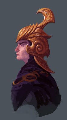
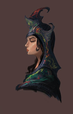
Here are the scans from my sketchbook the paintings were based on:
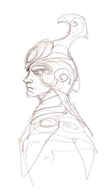
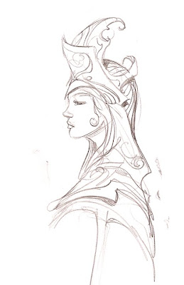


Here are the scans from my sketchbook the paintings were based on:


Thursday, February 11, 2010
Love my iMac
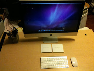
I have been a PC guy ever since buying my first IBM PS1 back in 1991. However I was recently compelled to buy an iMac 27" because of its' sheer awesomeness. I must say, I have not been disappointed. After a brief honeymoon period of about 2 months where I was getting comfortable with the OS, I can now confidently say this is my favorite computer I have ever owned. It runs like a dream, never crashes, and the 27 inch high resolution screen is gorgeous!
My only idiosyncrasy is that I was not a fan of the wafer thin wireless keyboard. I should have been, it is minimalist, well manufactured and designed, but I have a strange preference for thick "clicky" keyboards. So I replaced it with a daskeyboard.
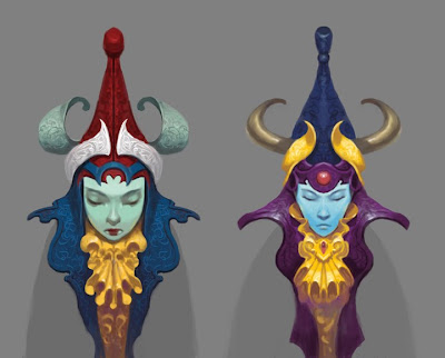
Here is a little something I did for fun on the iMac in Photoshop CS4 (using a Wacom Intuos3 wide pen tablet):
Saturday, January 23, 2010
WoW: Scourgewar

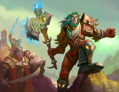 I guess the World of Warcraft Scourgewar set has been out for a while, so I suppose it's ok to post these now.
These took a few more revisions than normal. I've been scolded in the past for oversaturating so I have a tendency to paint muted, but the art director wanted the bottom one really colorful. It took a few iterations before I got it close to the right color range.
Subscribe to:
Comments (Atom)


