Time for my yearly art blog post. Does anyone remember when blogging was a thing? I miss those days.


Time for my yearly art blog post. Does anyone remember when blogging was a thing? I miss those days.
Art I did for the Warlord CCG many years ago. Later I inked the original sketch, changed the background, and used that art for the Beasties book of monsters.
The original acrylic painting was 11"x17" I think. I traded it to another artist, one of my heroes Christopher Moeller, for one of his amazing acrylic paintings.


 |
| Thrudr detail |


 |
| Detail |


 |
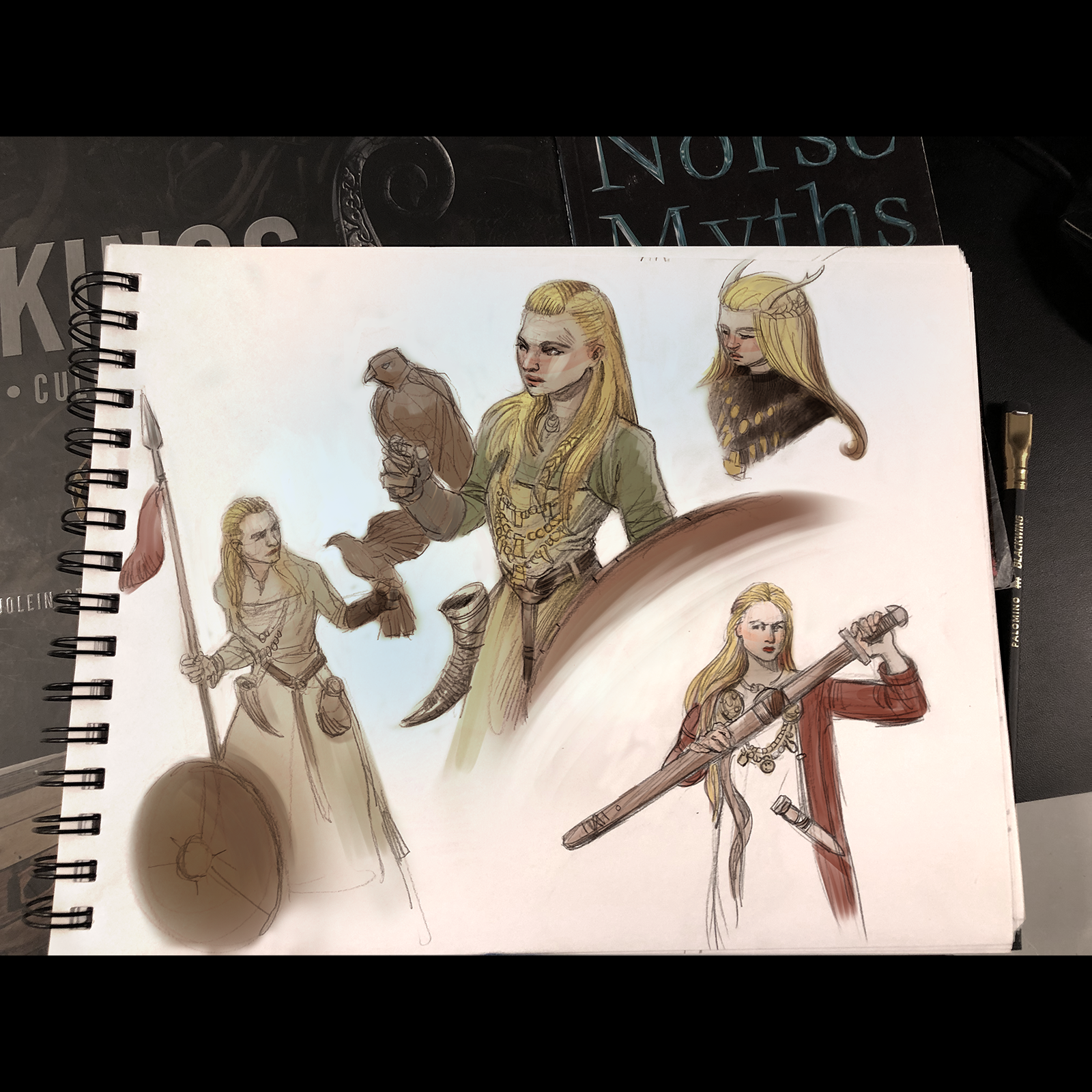
| Digitally colored sketchbook page |